
In this post, I will show the use of the UNICHAR function to make Power BI reports more interactive.
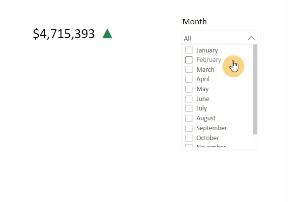
First, I selected the measure on which I want to choose the threshold. In this example, I picked the “Cost” measure. The “Cost” will change based on month selection.
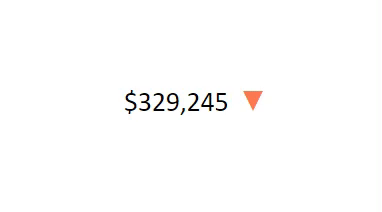
For this measure, I applied Black Up-Pointing Triangle when the “Cost” is greater than or equal to 500,000$ and Black Down-Pointing Triangle when the “Cost” is less than 500,000$. Check here for more information about Unicode characters.


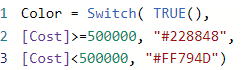
Next, I added the “#FF794D” color to the Down-arrow triangle and the “#228848” color to the Up-arrow triangle using this switch measure:
Check here for picking the color.
Then, I added Color measure in Conditional formatting >> Font color to the Unichar measure.
*Note that I put measures in Table visual and matched all headers and grid colors with a background color which in this example is white.

Then select OK:

After applying these steps, then we can see the result:
Here is the final result of the visual:
Write your thoughts in the comment. 👊
