
New Card Visual is the latest update in Power BI from Microsoft. I was playing with that to see how it works, so I prepared a demo to show you two examples of this new Card visual.
I added the visual to Power BI canvas:

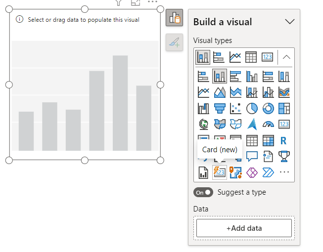
Add data to the Card, by default it looks like this:

Changed the shape from rectangle to the Snipped tab:

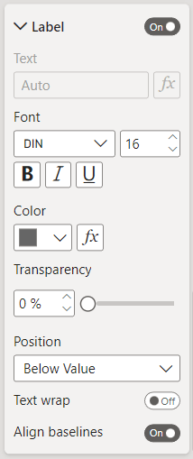
Then added the label set:
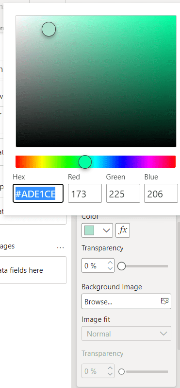
Next, change the color of the Background:
Added the Shadow and the Glow:


For better looking, added an Accent bar:

In the end, the Card looks like this:

As a second example, I changed the settings:


For adding the background, I created a simple rectangle by using Figma and after exporting, added that to the Card background:


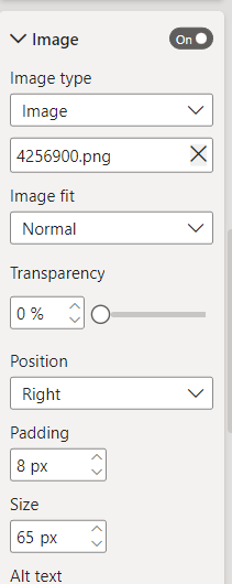
For more beauty, I added an image to the Card:
And here is the result:

New Card visual is an easy way to design Card visuals in Power BI reports.
Do you use this visual from now? Comment your thoughts.
