In this post, I will go to an example of creating great visuals with the help of the new power bi feature called “Custom label” in visual labels.
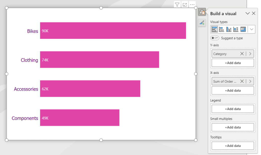
In this example, we have a Clustered Bar chart with “Category” and “Sum of Order Quantity”:
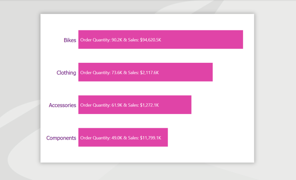
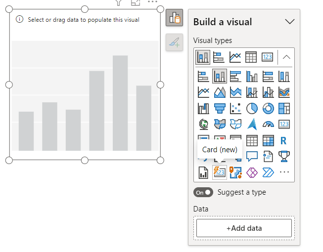
The label shows the Sum of Order Quantity for each category, But I like to see “Sales Amount” also in my visual label. To find “Custom label”, first go to “Format” of the Visual then select “Data Label” part:
Next, click on “ON” for the “Custom label” section:
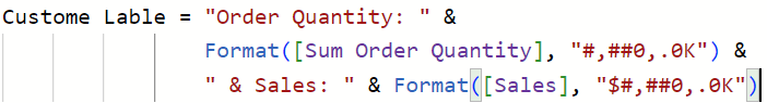
In the “Field” add measure “Custom label”:
Then give the result we were looking for. “Order Quantity and Sales” on the same label.
“Custom label” will bring your visual information and view to the next level.
For more details please refer to this YouTube video from Bas:
Sometimes clients ask for details when clicking on the specific field in the visual of the report page. One of the best ways to show it without putting lots of space on the main page is Drill Through in Power BI reports.
In this post, I will show an example of using the Drill Through in the report.
Start by creating the details page to show more details to clients about the main Category they will select. So I gathered all possible details on one page based on Categories and named it “Category details”:
Once the details page is ready, fix the page instead of standard –> Drill Through and select the data based on the Category filter. The top left corner of the page’s back arrow will be created by default:
Then on the main page in each category selecting “Drill through” will appear:
If you want to use left-click for this purpose then active the “Drill Through” on the top ribbon and then use the Category Drill Through selecting:
If you use “drillthrough” in your Power BI reports, comment below.
The magic run can use for running a notebook from another notebook in Databricks. The magic run is %run followed by the other notebook path. In this example, Demo2 is the name of the Notebook we want to use in the magic run path.
I picked the path from the notebook and put it in the %run:
After running the notebook, goes and run the notebook Demo2.
If Comment adding to the cell of %run, it will fail after the run and not find the notebook path:
I hope Databricks solve it in the new update. But for now %run will fail if a comment adds to the cell.
New Card Visual is the latest update in Power BI from Microsoft. I was playing with that to see how it works, so I prepared a demo to show you two examples of this new Card visual.
I added the visual to Power BI canvas:
Add data to the Card, by default it looks like this:
Changed the shape from rectangle to the Snipped tab:
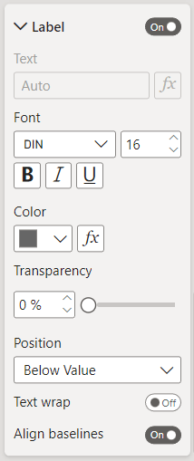
Then added the label set:
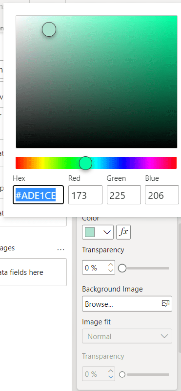
Next, change the color of the Background:
Added the Shadow and the Glow:
For better looking, added an Accent bar:
In the end, the Card looks like this:
As a second example, I changed the settings:
For adding the background, I created a simple rectangle by using Figma and after exporting, added that to the Card background:
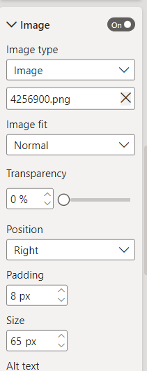
For more beauty, I added an image to the Card:
And here is the result:
New Card visual is an easy way to design Card visuals in Power BI reports. Do you use this visual from now? Comment your thoughts.
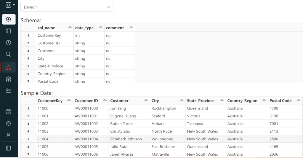
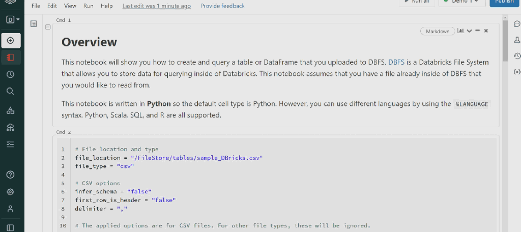
In this post, I will import the sample CSV file to Databricks. I created sample data from the AdventureWorks database and saved it in a CSV file.
For importing that to Databricks, select Create >> Table:
The page with this interface will appear:
Browse for the CSV file:
There are two ways to create the Table:
First: Create Table with UI >> Once you click on this, cluster selection will appear:
Select the cluster and preview the table:
Fill in the Table Name ( just lowercase is allowed and no space), then fix data types ( I changed “CustomerKey” STRING to INT), Column delimiter, and File Type, and the First row is header and preview the table:
After clicking on Create Table:
Next, query the table:
In each cmd cell in the Notebook to change language, we can use %. For example in this Demo1, I used %sql to change the cell language from Python to %sql because the Demo1 Notebook default language is Python in this example. For checking the table, you can open Data Explorer:
The second choice is Create Table in Notebook. Selecting this will create the Notebook and you can run it to have your new table:
I changed the first_row_is_header = “true” from false, As my table has a header.
As you can see, we have all datatypes String.
In schema definition, we can change datatypes by importing types to the cmd cell. I will explain the types in future posts with more details. For example, if you want to change the type to Integer for “CustomerKey”:
here is the result:
You like to start with Databricks??? Leave your comments. 👊
Dynamic formatting for measure is the way that we can define the format for measure, no matter the measure is using which data type.
I will explain this topic by the example.
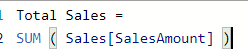
I have the simple dataset and created the “Total Sales” measure just for the example and use this measure in two different kind of use cases for the dynamic format string.
The first scenario is when we need to show the amount of measure with ” K, M, B” instead of 3, 6, and 9 zeros at the end. So, I selected the measure –> Format –> Dynamic. Once click on Dynamic, the measure will have a dropdown for format setting. In the Format part, we can do each format that we want. For example, I put this:
And after applying this format, here is the result:
We can order this measure, and it is not counting as a string.
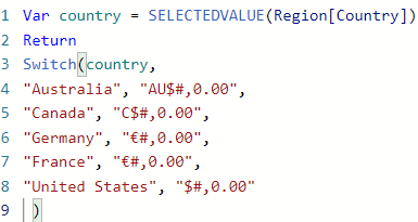
The second Scenario is about the country’s currency. We can define the currency symbol for each country and show it all in the same measure. Here is the Format that I used for the dynamic currency:
And here is the result:
And still we can order this measure:
For more details please look at this YouTube video by Parvinder:
Azure Databricks is a unified set of tools for building, deploying, sharing, and maintaining enterprise-grade data solutions at scale. The Azure Databricks Lakehouse Platform integrates with cloud storage and security in your cloud account and manages and deploys cloud infrastructure on your behalf. For more details, click here.
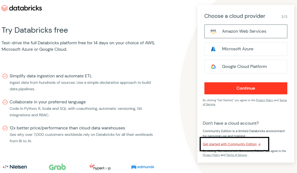
You can start with Databricks for free. First, create an account in the Databricks community edition.
Click on “Try Databricks“. It will drive you to this page and create your Databricks account:
Next, click on continue and this page will show the cloud provider, then click on “Get started with Community Edition“:
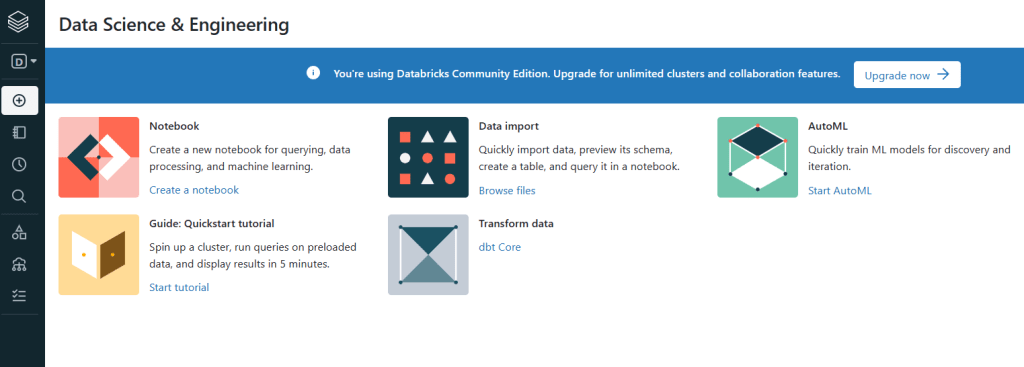
Now, You can start with Databricks, I selected Data Science & Engineering:
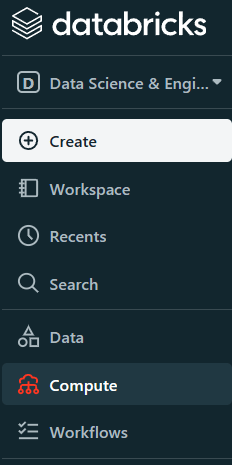
The first step is creating the cluster, to run the code. Click on Compute and select Create Compute:
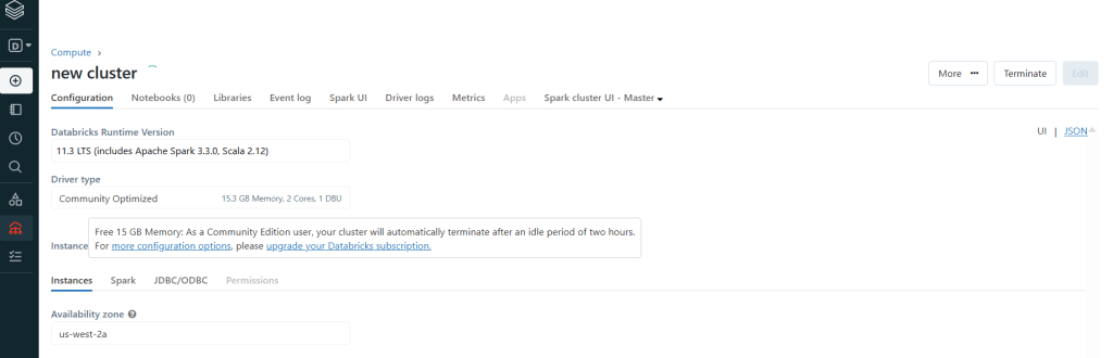
Create New Cluster:
After creating a cluster it will start automatically, but it will stop when not used.
For running codes in the new Notebook, we should start the cluster first.
What is Notebook?
In Azure Databricks, notebooks are the primary tool for creating data science and machine learning workflows and collaborating with colleagues. Databricks notebooks provide real-time coauthoring in multiple languages, automatic versioning, and built-in data visualizations. (More details)
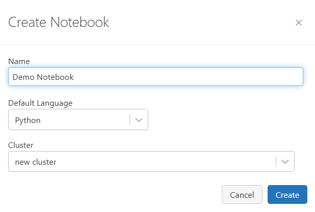
For creating the Notebook, select Create or go to your workspace and right click on the white space and select Create –> Notebook.
Then Name the Notebook and choose the Language you want to code, then select the Cluster to attach to the Notebook –>Create:
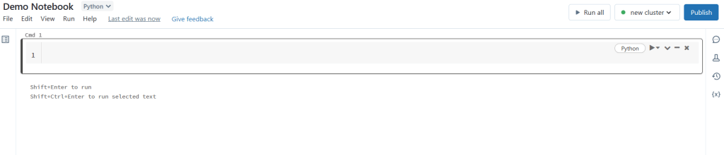
After, you will see the Notebook. In each cmd, you can write the code:
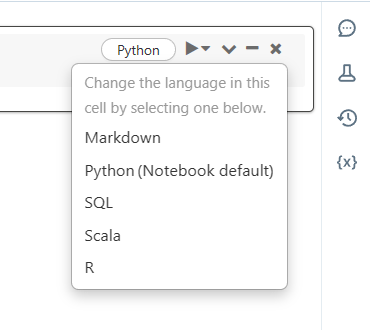
There are Languages you can choose. The beauty of the Notebooks is that you can switch between languages:
I will continue with Databricks in future blog posts.
Today, I created a demo about the Field parameter and would love to share the details with you.
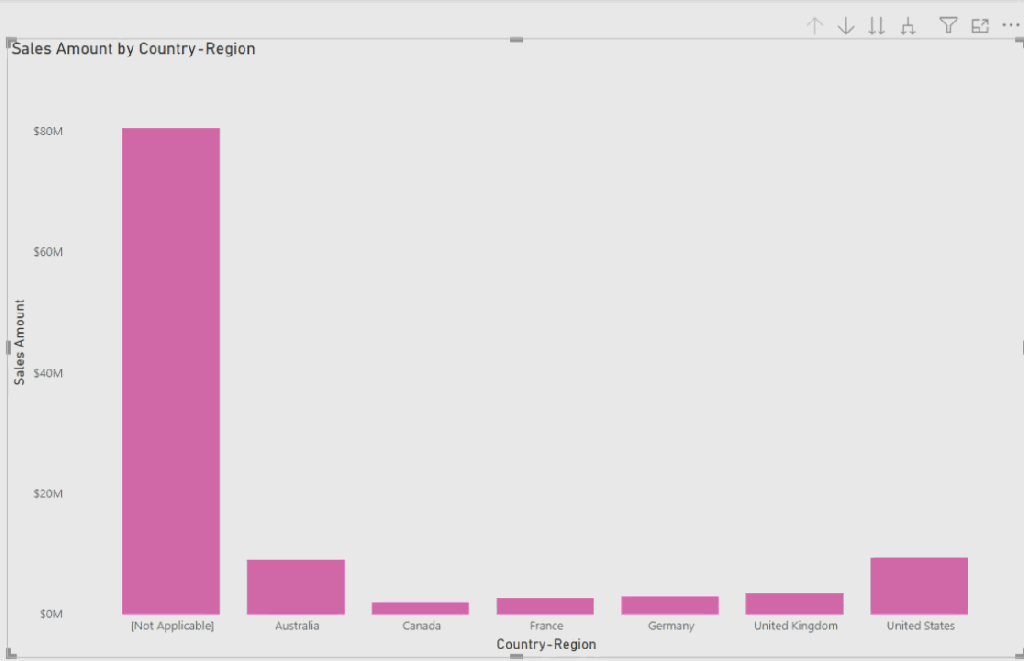
I used Adventure Work DB and added a bar chart to the report page. In this bar chart, we have a hierarchy of Country-Region, Category, and Color fields in x-Axis, and the “Sales Amount” for the values of y-Axis. Each time we can select the hierarchy dropdown in the bar chart for looking at “Sales Amount” in each field:
I was looking for a way to add a slicer that makes end-users comfortable selecting the field, instead of dropping it down from the chart. At this point, I ended up using the Field Parameter in the report.
First, I added a field parameter from the Modeling part of the Power BI desktop:
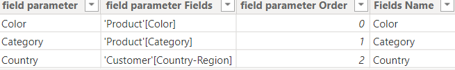
Then selected the Country-Region, Category, and Color fields for the slicer:
Note that the slicer will not be working till the Field parameter not added to the visuals:
I changed the name of the Country-Region field to the “Country”.
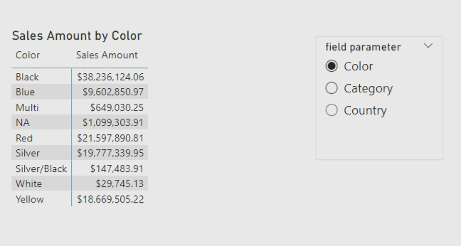
After adding a Field parameter to the bar chart, Slicer can filter the visuals and dynamically change the fields of the x-Axis:
I changed the visual to the Matrix visual and here is the result:
Then added the dynamic title for this visual by this simple code:
I added a column to the table because “Measure Title” should read field names from that column otherwise it is not work.
Here is the result after adding a dynamic title:
Are you using the field parameter? Comment your thoughts.
At the update in March 2023 of Power BI, we saw the new feature Clear all slicer button and Apply all slicer button. I created a demo and used these two buttons in the demo and I would like to share it with you. I started by clicking on “Insert” on the top ribbon of the Power BI desktop, then selecting “Buttons” and then “Clear all slicers“. Next, select ” Apply all slicers“.
Once these two buttons appear on the report page, simply start to use them. First, for applying slicers, I selected all slicers that were needed, then (Ctrl + click) on the “Apply all slicers” button. After clicking, Slicers will filter the report visuals based on the selection of all slicers.
For example, I selected Bikes in the Category slicer, Mountain Bikes on the Subcategory slicer, internet in the Channel slicer, and Black in Color slicer. Then (Ctrl + Click) on the “Apply all slicers” button.
Next, instead of going to each slicer and clearing one by one, (Ctrl + click) on the “Clear all slicers” button on the report page and clear all the slicers, then the report page will no longer show filters on slicers.
From now, I will use this feature more in my new reports. How about you? Comment below. 😊
Figma is adigital design and prototyping tool. It is a UI and UX design application that you can use to create websites, apps, or smaller user interface components that can be integrated into other projects.
Figma could be used to improve the report design in Power BI.
One of the main improvements in report designs is creating a related background for the report page.
In this post, I created a simple example of background by using this powerful design tool, Figma.
To start with Figma, I created an account using my google account and used that. For more details about it, click here.
As a simple example, I prepared one report page of the Power BI report.
On this page, there are four small visuals and one big visual.
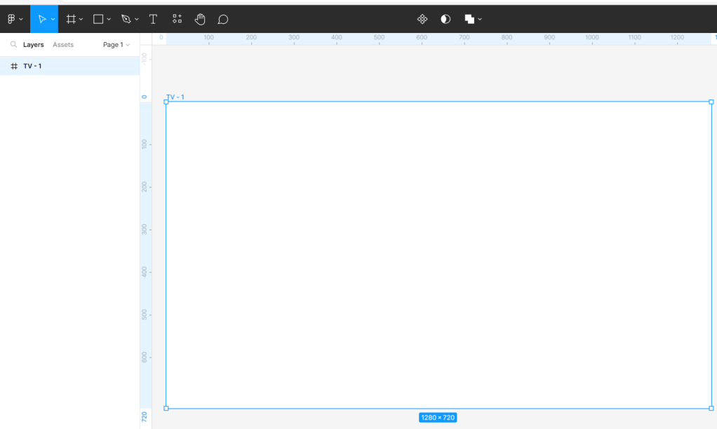
Before starting the creation of the background for this page, we should find the exact page dimension and use that dimension in Figma. By clicking on the white space of the report page in Power BI then selecting “Format page” in the Visualizations panel, in the “Canvas settings” there is the Height and Width of the report page, ” 1280 * 720″.
Next, open the Figma page and start with “New design file”.
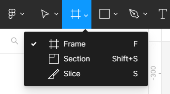
Continue adding “Frame” the same size as the Power BI report page.
Here, I selected “TV” frame.
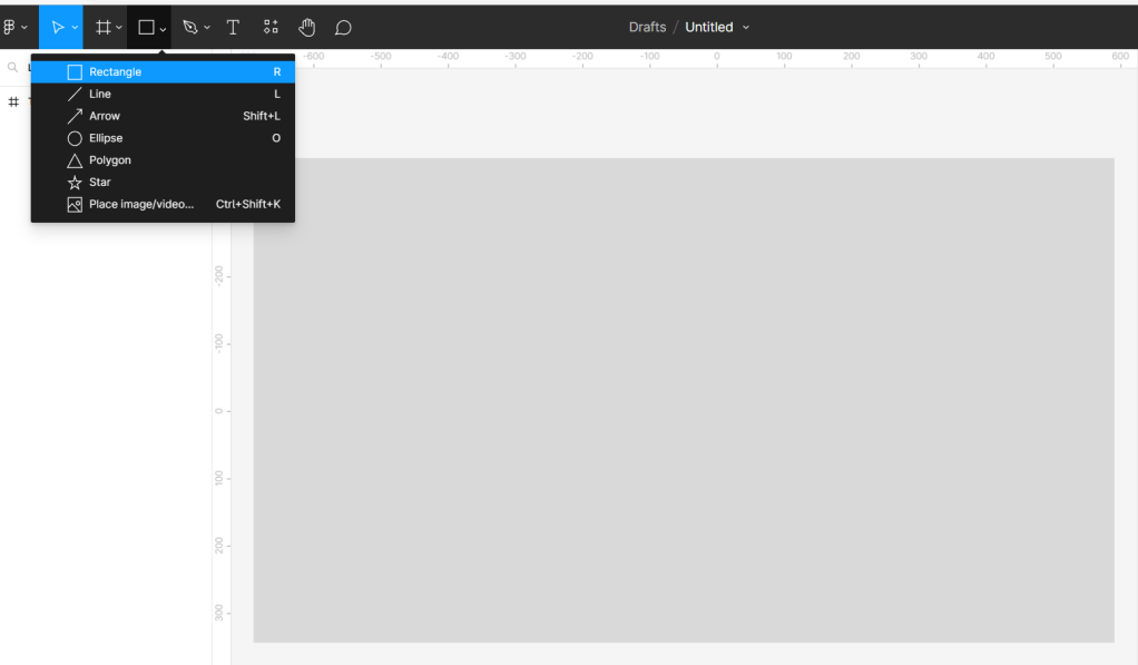
Then, added one rectangle (1280*720) on top of the Frame.
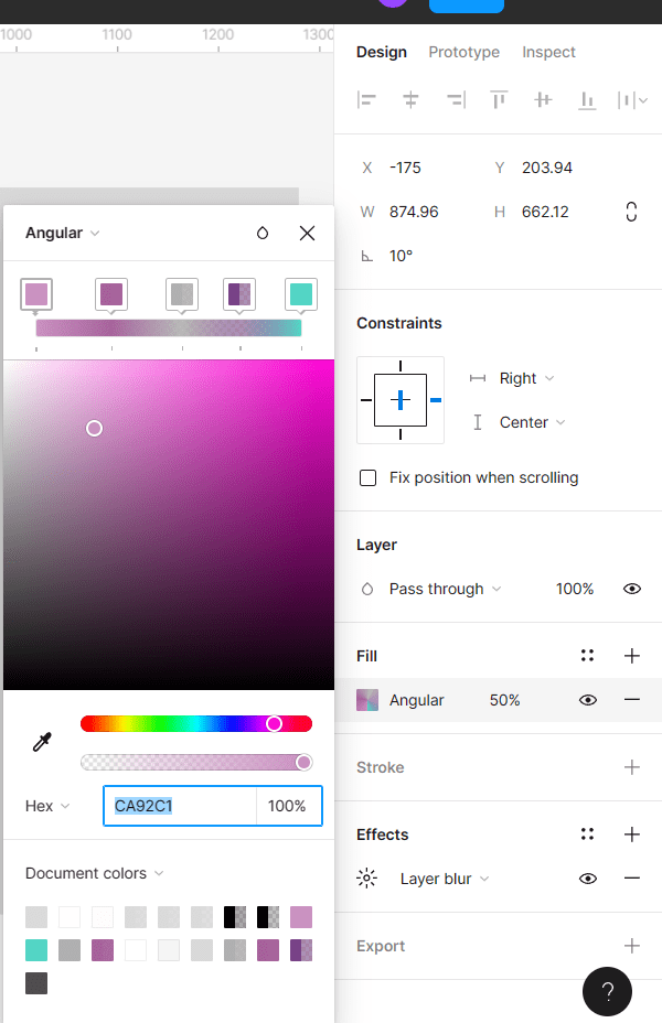
Next, added circles to add colors that I want on top of the rectangle.
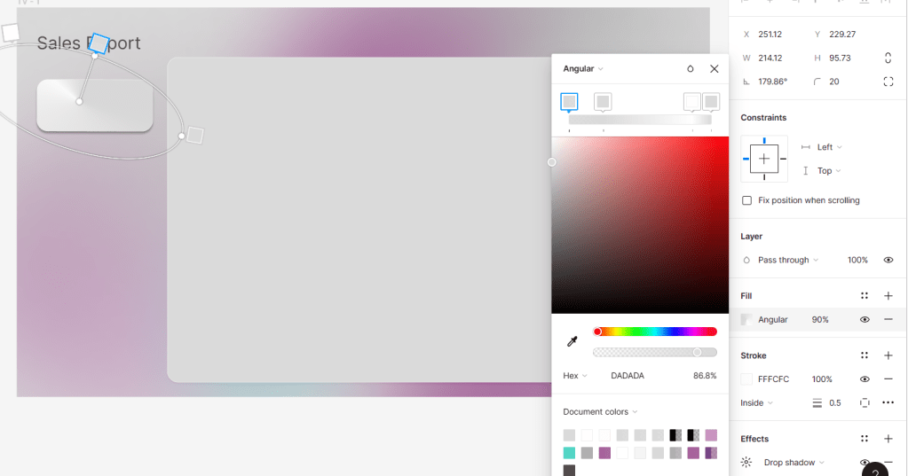
Here are the details of this circle filling with the Angular position and adding the colors you need for the report. I used random colors for this example:
In the “Effects” section, I used “Layer blur” with 200 “Blur”:
Then I copied more circles to fill the rectangle.
Here is the result for the first step of creating the report background:
Based on the Power BI report page, there is just one big visual, so I added one big rectangle on top of all steps with four angles curve 20. Fill it with “grey”, stork set to “white 0.5” and the effect is “Drop shadow”.
Then I added the name of report, “Sales Report”.
I added small rectangle and fill with “Angular” position,
The rest of the setting is the same as a big rectangle.
Then I copied three more of this small rectangle because we have four slicers on our report page:
Then I selected “TV-1” and exported it with the “SVG” format.
Then I added this SVG file as a background for the report page and removed all visual’s backgrounds and borders.
Here is the result:
Did you use Figma before? Which tools you use to design your Power BI reports?