In this post, I will create the dynamic title for the Table visual in Power BI report. This method can apply to almost all visuals with the title.
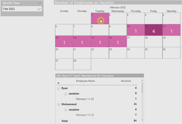
I used Calendar Visual to filter Table visual. For instance, selecting a date in the Calendar will filter the Table visual. Following pervious Post Tips#10 we have a date slicer and Calendar visual, and I added a Table containing details about employees’ leave types.
For creating the dynamic title, I wrote this measure:
And put it in the title of the Table visual.
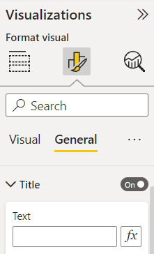
In Title dropdown click on fx, then in Title text >> Format style >> Field value >> measure Vacation Title all employee.
Now by selecting each date we have employee on leave, the number of employees and details inside the Table visual will change.
In this post, I will explain how businesses and employers can use Calendar visuals to record the number of employees on leave on specific dates.
Our primary aim is to achieve this result:
I prepared a demo for explaining Calendar visual by creating a table with sample data of employees and their leaving types. Here is a table named “Leaving Employee“:
First Step, I added a Date Table and made the relationship with the “Leaving Employee” Table.
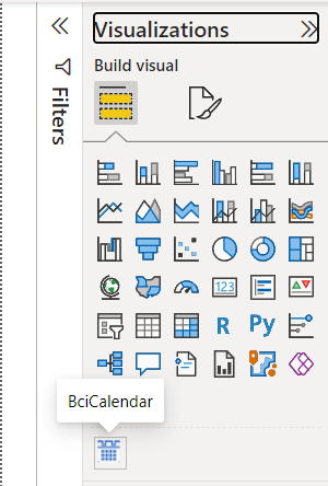
Next, I Imported “Beyondsoft Calendar” visual to the report:
Now, I can see the Calendar visual and click on that to add it to the report page:
Next, I created a measure to calculate the number of employees based on their leaving types.
I Wrote the “if” logical function in the last row of the code because I prefer to see the Calendar visual show up for months that have no records of the employees on leave. Otherwise, the Calendar visual doesn’t show up. As the “Leaving Employee” table has data mostly from February, I put a screenshot of this month here:
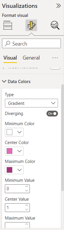
Also, we can set the empty part of the Calendar visual in the Format Visual by selecting Minimum Color in Data Colors same as Font Color in Data Labels. With this setup, we will have a whole year calendar even if there are months without employees on leave.
And now we reached the goal.
I will continue this topic in future posts. Leave your thought in a comment. 👊
In this post, I will show the use of the UNICHAR function to make Power BI reports more interactive.
First, I selected the measure on which I want to choose the threshold. In this example, I picked the “Cost” measure. The “Cost” will change based on month selection.
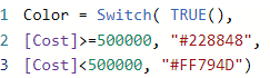
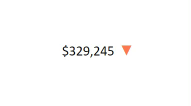
For this measure, I applied Black Up-Pointing Triangle when the “Cost” is greater than or equal to 500,000$ and Black Down-Pointing Triangle when the “Cost” is less than 500,000$. Check here for more information about Unicode characters.
Next, I added the “#FF794D” color to the Down-arrow triangle and the “#228848” color to the Up-arrow triangle using this switch measure:
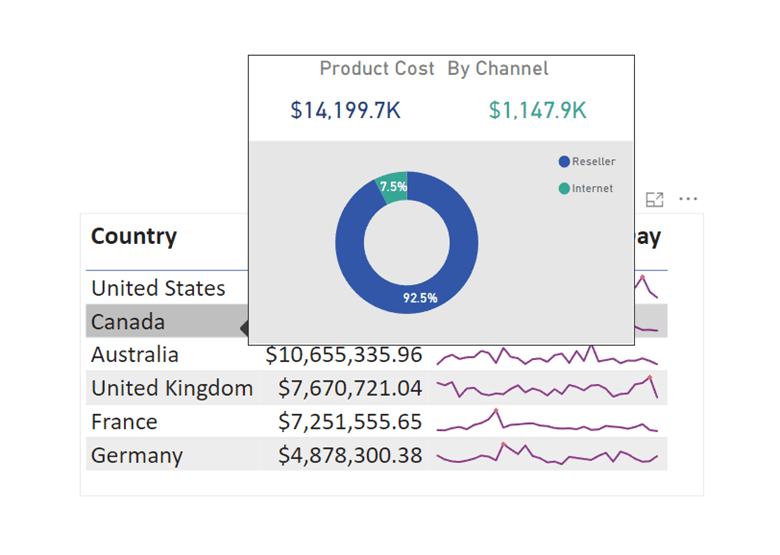
I use page tooltips rarely, but sometimes clients request to see more details in one visual. In this post, I will show how to create a tooltip page. I created a demo using Adventure Works Database. Start by choosing the page you want to be as a tooltip page. It is better to use a new page for this purpose.
Click somewhere on the page >>Visualization>> click on Format page>> page information and allow to use the page as a tooltip. In the Canvas setting, >> select Type as a Tooltip. Then choose vertical alignment by selecting Middle/Top. I like to go with Middle.
Next, we create all visuals and details that need to be on the tooltip page:
On the main page for the visual that we use the tooltip page on it, select that visual, click on Visualization>> Format Visual>> on the General tab, put Tooltipson>> then in Options drop-down >> in Type, select Report page, and in Page, put the tooltip page name.
And here is the result:
I hope you liked this post. Let me know what you think.
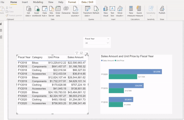
Have you ever faced a request from a client who asks for some visuals in a report with the ability to filter specific visuals but not all of the visuals on the report page?
For today’s post, I created a demo, together with an example. There are three visuals in this demo (a slicer, a clustered bar chart, and a table). Based on the relationships between tables (Adventure Work database), Filtering Fiscal Year will affect both other visuals on this report page.
I want the slicer to solely filter the clustered bar chart and not the table.
Also, I want the selection of each cell in the table to make the clustered bar chart highlighted.
First, select the Slicer >> go to Format tab >> click on Edit Interactions, then select None for table visual. So, the slicer will filter the clustered bar chart, not the table visual.
Next, select the Table >> go to Format tab >> click on Edit Interactions, then select Highlight on top right corner of clustered bar chart visual.
After this setting, by clicking on each table cell, the clustered bar chart will highlight it.
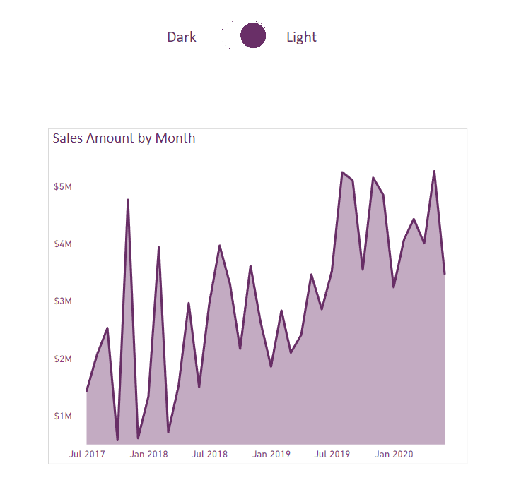
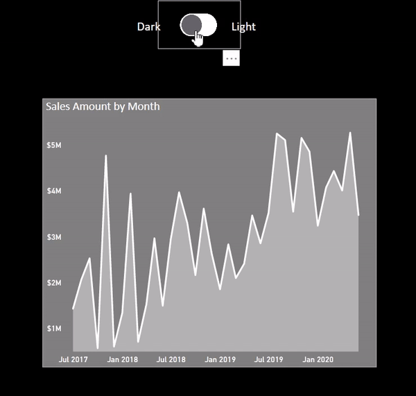
As promised, I prepared a demo to show you how we can use toggles to switch colors in Power BI reports from Dark to Light mode and reverse.
In this post, I will show you this design with an example..
First, I created a light colors for visuals on this report’s page. Then, I add the toggle on this page and two texts named “Dark” / “Light” on both sides of the toggle.
Next, I duplicate all visuals with dark colors from this page at the same position inside the same page, then I hide the visuals that existed here with light colors. I just need to add a new toggle with the grey color pointing to the Left (Dark) and put it on top of the existing toggle.
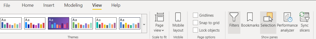
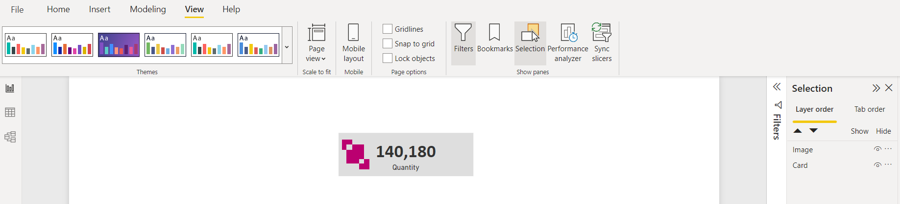
For creating a dark background in Dark mode, go to View tab >> select Selection pan >> Layer order and put a rectangle shape with black color; under all visuals. By doing this, the Shape will appear behind all visuals.
Shape at the end
Then by following the steps from my previous toggle post, I made this toggle that works perfectly.
As you may probably know, Power BI comes with a feature for creating page navigation visuals, and in this post, I will show you how to use this page navigation in Power BI.
There are many ways to achieve this, so, in this post, I will explain my two favorite ways to keep it short. I will cover other approaches in future posts.
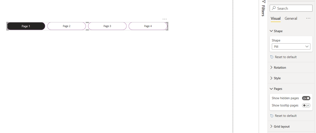
The first method is by clicking on the Insert tab in Power BI, and going to the Buttons, and selecting Navigator then Page navigator creates the visual page navigation which will show all pages that you have in the report.
The option Show hidden pages will add/remove hidden pages in the visual.
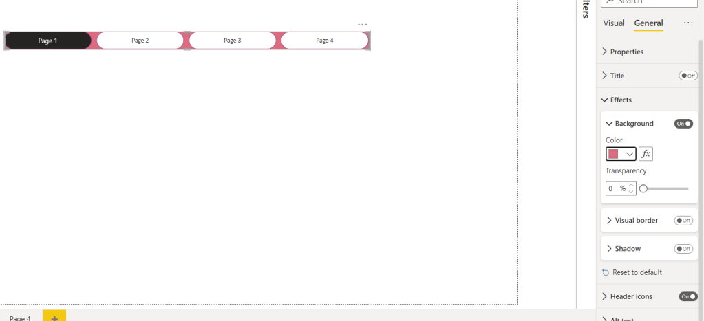
Also, there are options to design the visual by changing items in effects, default, color, or each type of design you like for the report. The benefit of this approach is that once you remove one page, it will automatically hide the item with the name of that page inside the visual. For example, I removed Page 4.
Another main benefit of this approach is that once an effect is added to the visual, it will apply to all buttons, like Shadow, Background,…
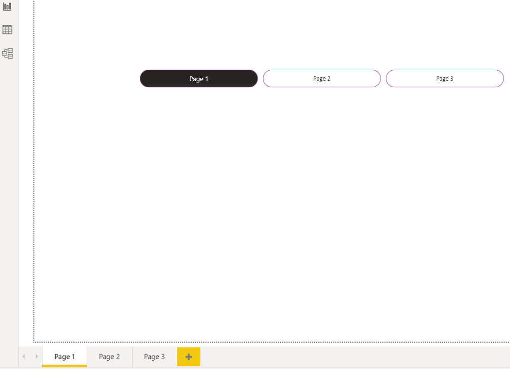
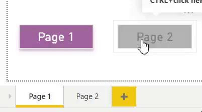
The second approach is to add a button/shape for each page. In this example, I put a rectangular shape for each page. I have two pages for this report.
I start by selecting the Image tab, clicking on the rectangle shape, and putting two rectangles for my pages. I chose a random color for the same page, and for the other page, I picked the color grey. When you are on Page 1, click on page 2 shape, set Action to on >> Type to Page navigation >> Destination to Page 2.
Next, go to page 2, click on page 1 shape, and set Action to on >> Type to Page navigation >> Destination to Page 1.
now, you will see the result:
Have you used any of these before? Let me know your ideas.
Which tool do you use when some design idea comes to your mind regarding the design of reports in Power BI?
Power BI offers many features such as shape, visual settings, etc…, to avoid bringing some pictures as a background and using just Power BI ability to design background. However, sometimes we are need of using an image based on the client’s request.
Personally, for diversifying my reports, I use a powerful software called Affinity Designer to design small icons that are related to report, and I add them to my visuals.
Affinity Designer, is a professional vector graphic design software. For more details about this tool, please visit here.
In this post, I will show you a quick example (for card visual), so that you can compare the Power BI card visual, before and after using an icon.
The first step after creating icons in Affinity Designer is to create the graphics with the selected colors we picked from our theme in the Power BI report. For this example, I simply picked a random color.
Once you make sure your icon design is complete, you can export that icon in any format that exists in Affinity Designer. I selected PNG format.
In this step, after saving the icon on your computer, you can insert this icon to the Power BI report by going to the Insert tab in Power BI >> select the “Image” and then choose icon:
The next step is adding icon to the card visual, so, put the image on top of the card visual and if it is not working by dragging the icon, go to the View tab in Power BI >> click on “Selection” >> select the “Layer Order“ and switch layers to order the image layer on top of card layer:
Next, we should group the icon and card visual so that we can move card visual around the report page easily. So, press Ctrl+Left-Click and select both card visual and icon, then Right-Click and select group. You can do this either on the Report page or the Selection pane:
Now, you should have the card visual with an icon ready to use in the report.
You can compare the card visual before and after having an icon on top of that.
Let me know your idea and which tools you use to improve your design? comment your thoughts. 👊
Sometimes clients want to have as many details as they can when viewing reports in Power BI. One of the ways that we can implement to provide these details within the same page is by having a toggle that switches summary/details sections on and off.
Toggles can be used in lots of different situations, for example: some reports need to have dark/light mode, two languages or summary/details, etc.
I created a demo (using AdventureWorks database) and will show you step by step how to create a toggle in your report.
To get started, we will need to design our toggle buttons. In our case, I designed 2 button images that look identical to each other, however one of them is pointing to the right, the other is pointing to the left. Now we need to place these 2 images on top of each other in our report and provide them with a description that would appear beside these toggles.
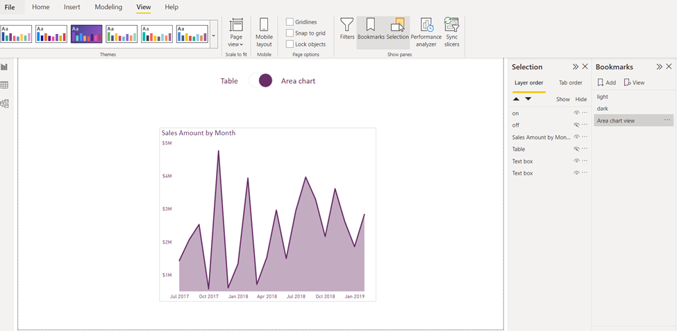
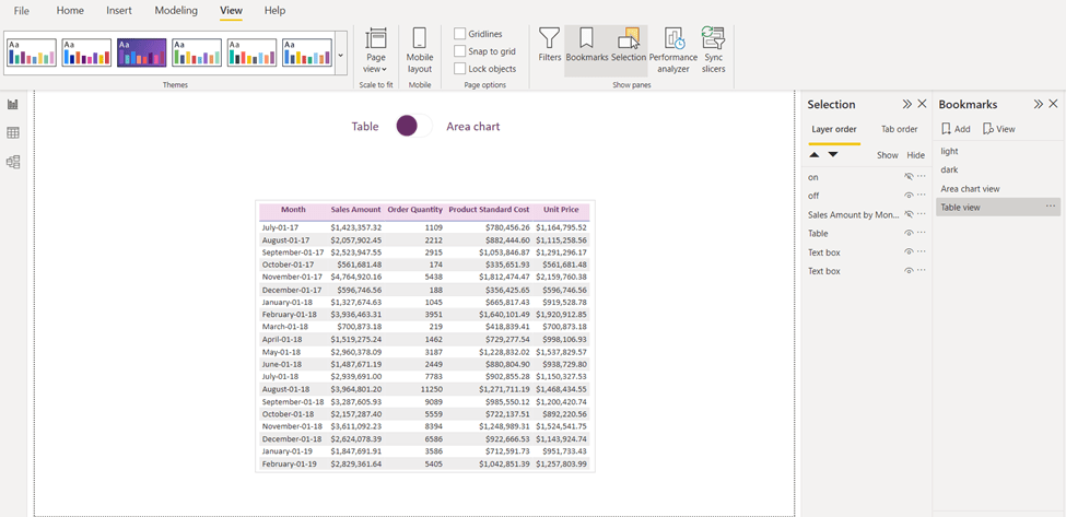
Next, we should prepare all visuals that we need for our page for both sides. For example, in this demo I am showing two views; one table view and another for area chart view. I want to show the table when the toggle is pointing towards the table and show the area chart, when the toggle is pointing towards the area chart.
After preparing the toggle images and all visuals that will appear in both views, we hide one view and leave the other visible. Next, we will go to the View tab in Power BI >> Select the “Selection” and “Bookmarks” tabs in the ribbon.
Hide everything you do not need in the area chart view, and then click “Add” in the Bookmarks panel, give it meaningful name like “Area chart view”.
Then again for the table view, in the Selection panel, hide everything we do not need to see in our table view, then click “Add” in the Bookmarks panel, and name it “Table View”.
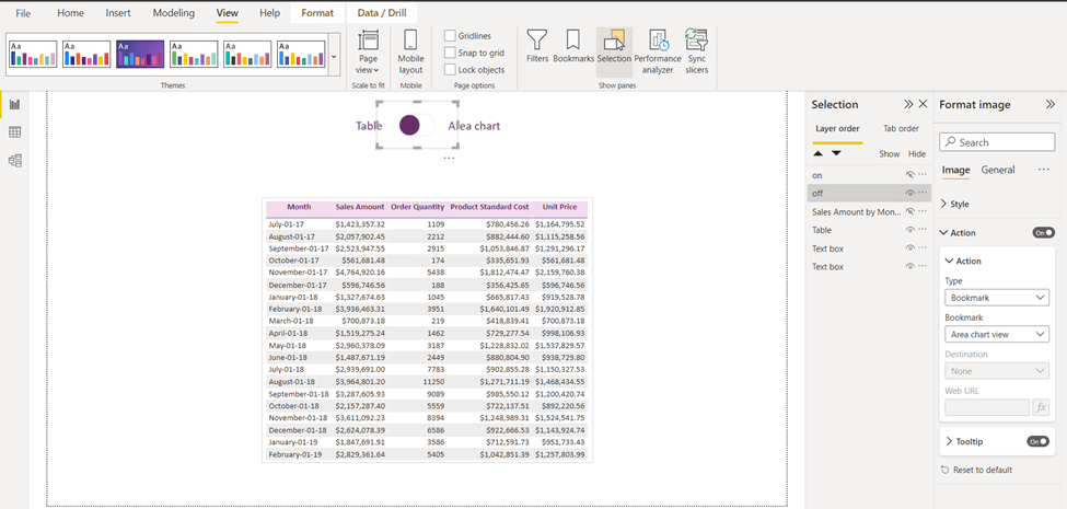
Second step is to add an action to our toggle images. Click on the toggle image that is pointing to the Table:
Go to format image>> action >> bookmark type then select “Area chart view”, that is all we need to do for this toggle. Next, once you press Ctrl+Left-Mouse Click on the toggle; you will go to the “Area chart view”.
For the last step, go to Area chart view and click on the toggle that is pointing to the Area chart, in format image>> action >> bookmark type then select Table view:
And you will see the result as below:
I have created another demo for dark/light mode. Let me know if this is something you would like to implement in your reports.
Will you use the toggle functionality from now on or have you ever used it before?
I would love to hear your thoughts and comments about this post.
When designing a report in Power BI that includes many visuals, it is important for the designer to have a feeling for the end result of the report while working on it. Many options in Power BI would enable us to control how reports look like at the time of the design; and one of these options is the Modern Visual Header.
First of all, let’s see how this option can be toggled and then we can discuss the benefits of having it turned on. You can enable/disable this option (on the current file only) by going to the File tab > Options and settings > Options:
In the options page, scroll down under the “Current File” section, click on Report settings. The option will be available as in the screenshot below:
Now, what is the benefit of having this option turned on? With this setting turned on, it will not add any design-specific padding to the visual which will enable the designer to view all visuals in their real sizes at design time. If this option is turned off, visuals will have that extra padding during design time which can be confusing to designers.
IMO, having this option always enabled makes it easier for me as a report designer to measure spaces between visuals and know exactly how my report would look like while I’m at it!
Do you think this option is useful? Have you ever needed to turn it off and have these extra paddings? Let me know in the comments!