
Today, I created a demo about the Field parameter and would love to share the details with you.
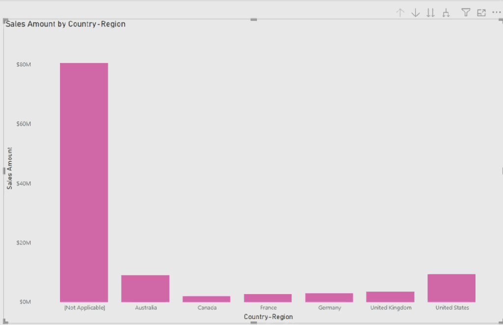
I used Adventure Work DB and added a bar chart to the report page. In this bar chart, we have a hierarchy of Country-Region, Category, and Color fields in x-Axis, and the “Sales Amount” for the values of y-Axis.
Each time we can select the hierarchy dropdown in the bar chart for looking at “Sales Amount” in each field:
I was looking for a way to add a slicer that makes end-users comfortable selecting the field, instead of dropping it down from the chart. At this point, I ended up using the Field Parameter in the report.
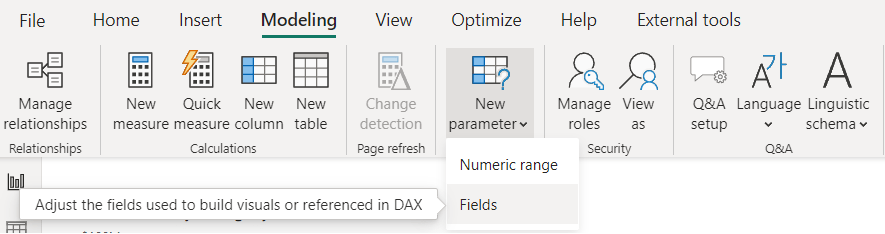
First, I added a field parameter from the Modeling part of the Power BI desktop:
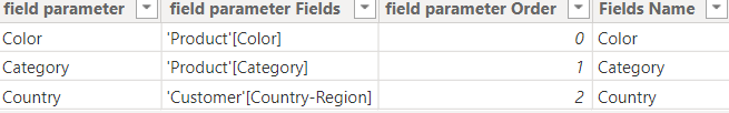
Then selected the Country-Region, Category, and Color fields for the slicer:

Note that the slicer will not be working till the Field parameter not added to the visuals:
- I changed the name of the Country-Region field to the “Country”.


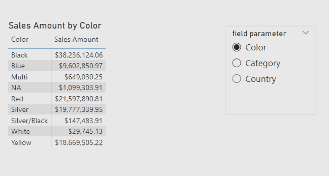
After adding a Field parameter to the bar chart, Slicer can filter the visuals and dynamically change the fields of the x-Axis:

I changed the visual to the Matrix visual and here is the result:

Then added the dynamic title for this visual by this simple code:

I added a column to the table because “Measure Title” should read field names from that column otherwise it is not work.
Here is the result after adding a dynamic title:
Are you using the field parameter? Comment your thoughts.

عالی 👍🏻
LikeLike
merci Hossein jan.
LikeLike
Thank you for the explanation it was very clear. Can you please share me your YouTube channel or any certain groups so that I could join and learn many things.
LikeLike
I am glad you liked it.
Here is our YouTube channel: https://www.youtube.com/@PowerBIHowTo and this is my video there:
LikeLike