
-
Bring your design to the next level – Power BI Tips #4
Which tool do you use when some design idea comes to your mind regarding the design of reports in Power BI?
Power BI offers many features such as shape, visual settings, etc…, to avoid bringing some pictures as a background and using just Power BI ability to design background. However, sometimes we are need of using an image based on the client’s request.
Personally, for diversifying my reports, I use a powerful software called Affinity Designer to design small icons that are related to report, and I add them to my visuals.
Affinity Designer, is a professional vector graphic design software. For more details about this tool, please visit here.
In this post, I will show you a quick example (for card visual), so that you can compare the Power BI card visual, before and after using an icon.
The first step after creating icons in Affinity Designer is to create the graphics with the selected colors we picked from our theme in the Power BI report. For this example, I simply picked a random color.

Once you make sure your icon design is complete, you can export that icon in any format that exists in Affinity Designer. I selected PNG format.

In this step, after saving the icon on your computer, you can insert this icon to the Power BI report by going to the Insert tab in Power BI >> select the “Image” and then choose icon:

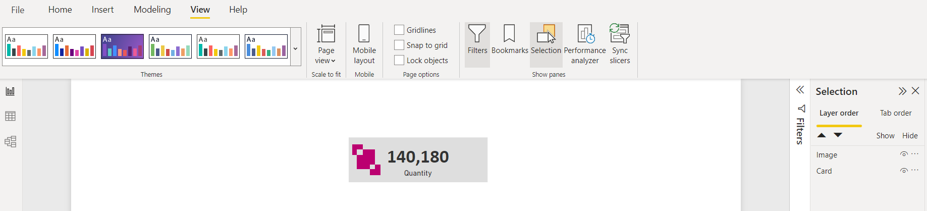
The next step is adding icon to the card visual, so, put the image on top of the card visual and if it is not working by dragging the icon, go to the View tab in Power BI >> click on “Selection” >> select the “Layer Order“ and switch layers to order the image layer on top of card layer:
Next, we should group the icon and card visual so that we can move card visual around the report page easily. So, press Ctrl+Left-Click and select both card visual and icon, then Right-Click and select group. You can do this either on the Report page or the Selection pane:

Now, you should have the card visual with an icon ready to use in the report.

You can compare the card visual before and after having an icon on top of that.
Let me know your idea and which tools you use to improve your design? comment your thoughts. 👊
-
How to create toggle buttons in Power BI? – PowerBI Tips #3
Why do we use toggles in our Power BI reports?
Sometimes clients want to have as many details as they can when viewing reports in Power BI. One of the ways that we can implement to provide these details within the same page is by having a toggle that switches summary/details sections on and off.
Toggles can be used in lots of different situations, for example: some reports need to have dark/light mode, two languages or summary/details, etc.
I created a demo (using AdventureWorks database) and will show you step by step how to create a toggle in your report.
To get started, we will need to design our toggle buttons. In our case, I designed 2 button images that look identical to each other, however one of them is pointing to the right, the other is pointing to the left. Now we need to place these 2 images on top of each other in our report and provide them with a description that would appear beside these toggles.
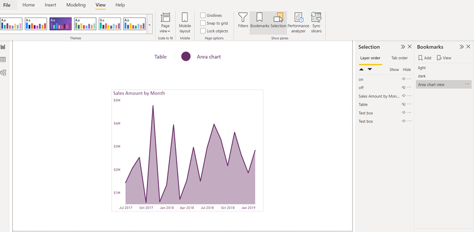
Next, we should prepare all visuals that we need for our page for both sides. For example, in this demo I am showing two views; one table view and another for area chart view. I want to show the table when the toggle is pointing towards the table and show the area chart, when the toggle is pointing towards the area chart.
After preparing the toggle images and all visuals that will appear in both views, we hide one view and leave the other visible. Next, we will go to the View tab in Power BI >> Select the “Selection” and “Bookmarks” tabs in the ribbon.
Hide everything you do not need in the area chart view, and then click “Add” in the Bookmarks panel, give it meaningful name like “Area chart view”.
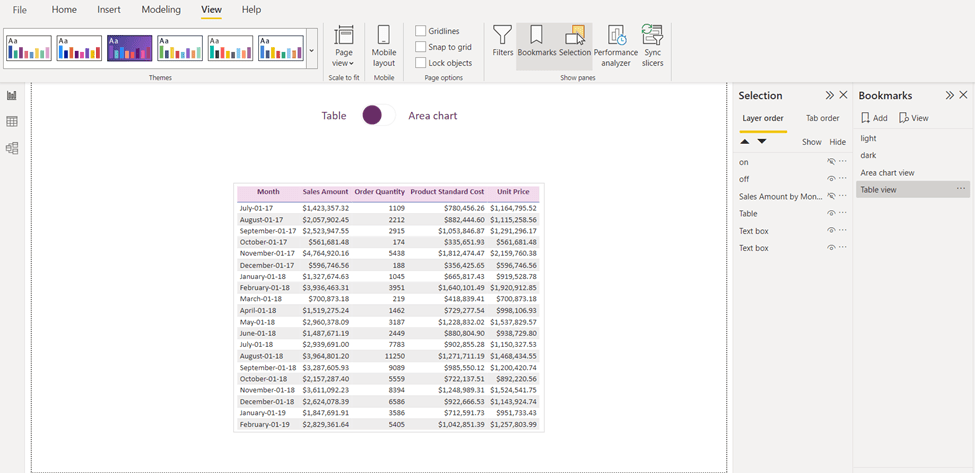
Then again for the table view, in the Selection panel, hide everything we do not need to see in our table view, then click “Add” in the Bookmarks panel, and name it “Table View”.
Second step is to add an action to our toggle images. Click on the toggle image that is pointing to the Table:
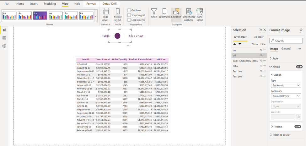
Go to format image>> action >> bookmark type then select “Area chart view”, that is all we need to do for this toggle. Next, once you press Ctrl+Left-Mouse Click on the toggle; you will go to the “Area chart view”.
For the last step, go to Area chart view and click on the toggle that is pointing to the Area chart, in format image>> action >> bookmark type then select Table view:

And you will see the result as below:

I have created another demo for dark/light mode. Let me know if this is something you would like to implement in your reports.
Will you use the toggle functionality from now on or have you ever used it before?
I would love to hear your thoughts and comments about this post.
-
Why Use The Modern Visual Header In Power BI? – Power BI Tips #2
When designing a report in Power BI that includes many visuals, it is important for the designer to have a feeling for the end result of the report while working on it. Many options in Power BI would enable us to control how reports look like at the time of the design; and one of these options is the Modern Visual Header.
First of all, let’s see how this option can be toggled and then we can discuss the benefits of having it turned on. You can enable/disable this option (on the current file only) by going to the File tab > Options and settings > Options:

In the options page, scroll down under the “Current File” section, click on Report settings. The option will be available as in the screenshot below:

Now, what is the benefit of having this option turned on? With this setting turned on, it will not add any design-specific padding to the visual which will enable the designer to view all visuals in their real sizes at design time. If this option is turned off, visuals will have that extra padding during design time which can be confusing to designers.

IMO, having this option always enabled makes it easier for me as a report designer to measure spaces between visuals and know exactly how my report would look like while I’m at it!
Do you think this option is useful? Have you ever needed to turn it off and have these extra paddings? Let me know in the comments!
-
Speed Up Your Reports Design With PowerToys – Power BI Tips #1
Microsoft PowerToys is one of the best tools I have ever used for picking colors and taking color formats and their strings. When we start designing our reports in Power BI Desktop, the first step is having the right colors in our pallet for creating themes.
How we can bring colors from companies’ websites, logos, pictures, etc.. related to our reports?
There are so many ways to do this but one of the best ways is using PowerToys.
To get started, download and install PowerToys using this link. Once you have it installed, make sure you have it open in the background.
To use PowerToys to pick any color, you can utilize the default shortcut “Win + Shift + C”. This will allow you to pick any element on your screen to get its color. When you choose an element, you will see the color format and their string representation as below:

Color formats that PowerToys supports :
HEX, RGB, HSL, HSV, etc.. and Power BI is comfortable with the HEX color format.If you want to change the default shortcut, simply open PowerToys, and from the Color Picker section, click on the edit icon to change the shortcut as you need:

For more information about Microsoft power toy, please visit here.
Do you think it would be useful for you as well? Please comment your ideas. 🎉🎉

